For fintechs, growth ultimately converges on one small moment — when a user decides to pay. Everything before that burns money until this click works.
So why do even the largest fintech players lose users here? In short, because most checkout pages still look like complex forms, not flows.
This guide breaks down how leading US and Canadian fintech companies are turning their checkout into a profit driver — and how any ambitious fintech startup can shrink the churn gap without learning it the hard way.
Baymard Institute’s 2025 report shows 70% of all carts are abandoned often due to checkout friction, unclear costs, or missing payment options. Source
The stakes are drastically higher if you’re building your fintech startup from the ground up: users drop off the moment they sense risk or delay.
A smooth checkout is more than just the UX polish — it's a growth multiplier.
Every extra click or redirect is a reason to drop off. Audit your user flow: how many steps does it take to complete payment?
Combine steps, preload data, and minimize page transitions — fewer clicks mean higher conversion.
A Capterra study found 82 % of users abandon when asked to create an account before paying. Guest or “pay-then-register” flows consistently outperform. Source
In 2025, fee fatigue is one of the biggest deal-breakers at checkout. Everywhere users look — there’s a fee. Credit cards often add around 3–3.5 % to every transaction. For small payments, it’s tolerable; for a $10 000 insurance or annual subscription invoice, that’s painful.
If that number appears only at the final confirmation step, many users will simply abandon the page. Whenever possible, highlight the cost upfront and let users choose.
In the US, ACH transfers usually cost under $1; in Canada, EFT payments average a flat $0.50–$3, depending on your bank. The difference between a fixed few dollars and a 3 % card fee is massive for high-value transactions.
If your margins allow, consider absorbing or partially covering card fees — it signals fairness and builds trust. At minimum, add a line like: “Prefer lower fees? Pay via ACH or EFT.”
Clarity here can save conversions that even perfect UI design can’t.
Over 70 % of North American fintech transactions happen on mobile, but that’s not universal.
If your clients pay for insurance, corporate invoices, or B2B renewals, mobile traffic might be small. Instead, ensure full browser support, especially for older enterprise environments.
A common developer mistake is constantly upgrading frameworks (Angular, React, libraries) that drop support for older browsers. If your customers use corporate laptops running older Edge or Safari versions, you’ll lose transactions unless your stack supports them.
Modern ≠ universal. Always test across browsers and versions — not just mobile.
Declines, vague messages, or redirect loops ruin trust.
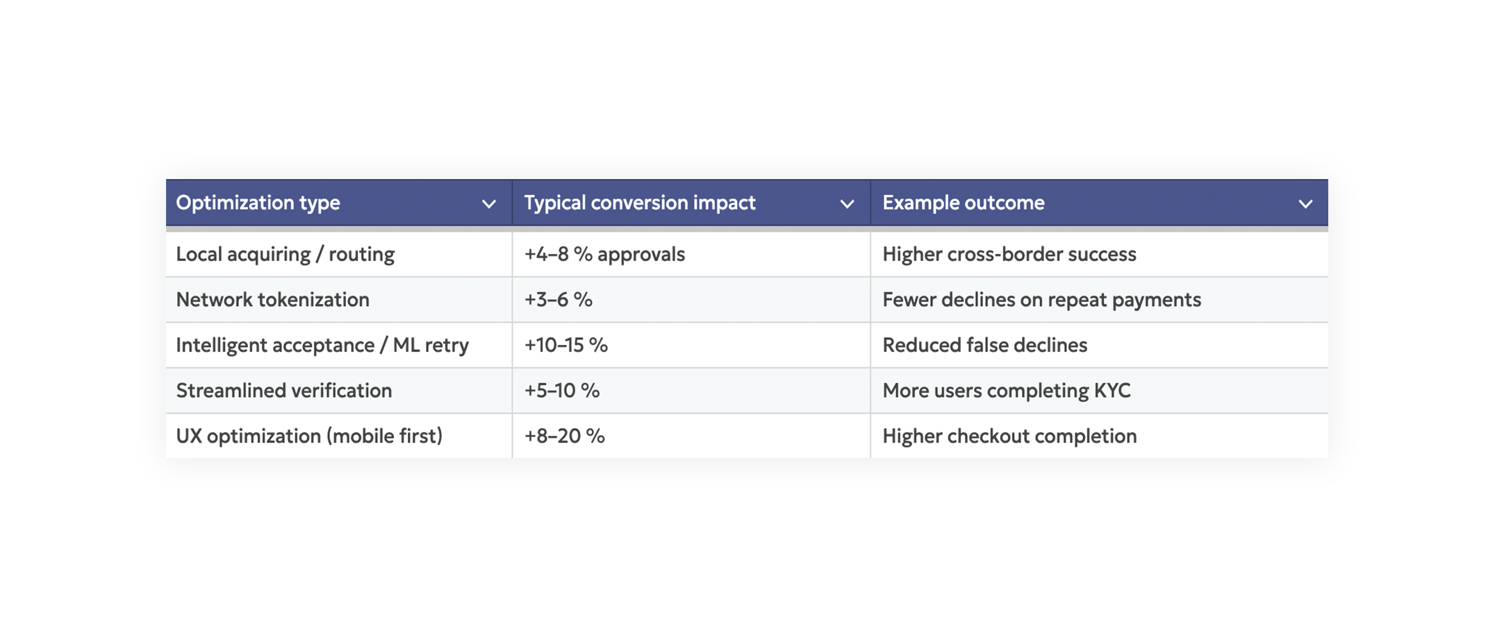
Studies across payment processors show that improving retry logic, fallbacks, and routing can recover 4–8% of lost payments.
A European marketplace refined its local-acquiring mix and dynamic routing, lifting cross-border acceptance by 4 %+ and eliminating thousands of failed transactions monthly.
A travel platform integrating “buy now, pay later” at checkout saw significant lift among younger buyers who prefer embedded credit instead of redirects.
A digital-banking startup that replaced manual document upload with AI-based ID verification cut onboarding time by half and increased completed sign-ups by 9 %.
Industry data from payment networks shows that enabling Apple Pay or Google Pay can lift mobile conversion 10–30 %, thanks to stored credentials and instant biometric confirmation.
The pattern is clear: conversion gains compound when technology and UX evolve together.
Track user sessions, heatmaps, and micro drop-offs (field-level analytics). Prioritize by revenue impact.
Don’t guess; quantify where users hesitate or quit.
Show total fees, estimated time, and security reassurance upfront.
Use a copy like “This payment is secured and processed instantly by our US-based gateway partner.”
Also include invoice details directly on the checkout page so users clearly see what they’re paying for and why.
No surprises = trust.
Let users pay first, then invite them to create an account post-transaction.
Tokenize returning users for frictionless repeats and re-engage them post-payment.
Offer cards, digital wallets, ACH, and regional rails (Interac e-Transfer, RTP, FedNow). But emphasize the cost difference: credit card ≈ 3 %, ACH/EFT ≈ flat fee.
Coverage builds trust; transparency builds conversion.
Adopt AI-based KYC with clear UI messaging: “Takes less than 60 seconds.”
Keep low-risk flows light, escalate only when necessary, and communicate timing clearly.
Implement dynamic routing (Checkout.com, Adyen, or Stripe Adaptive Acceptance).
A 1% acceptance-rate gain can equal hundreds of thousands in annual recovered revenue.
Experiment with button text, wallet order, and authentication methods.
Measure not only conversion but also error reduction per browser and device.
In the US and Canada, user expectations are unforgiving.
Users already experience near-instant payments through Cash App, Venmo, and Apple Pay — and they expect your fintech to match that speed and reliability.
▪ Uptime > 99.99%.
▪ Average processing time < 2 seconds
▪ Card-approval rate > 95 %
▪ SOC 2 + PCI DSS compliance visible to users
▪ Full browser compatibility (Edge, Safari, Chrome — old and new)
▪ Transparent fee summary before confirmation
Every millisecond and every reassurance message adds to perceived trust.
What’s a good checkout conversion rate for fintechs?
Average: 60–80 %.
Top performers with advanced routing and UX optimization reach 90 %+, with rare cases exceeding 95 %.
How long should checkout take?
Under 4 minutes from intent to confirmation, ideally closer to 2 minutes on mobile.
How do I reduce fintech-specific drop-offs?
Simplify KYC, make costs transparent early, and support instant-pay options native to your target market.
At Inspirit, we help fintech companies modernize payment architecture — from UX optimization to routing logic and verification automation.
If your acceptance rate lags below 95 %, you’re leaving money unclaimed.
👉 Let’s audit your checkout together